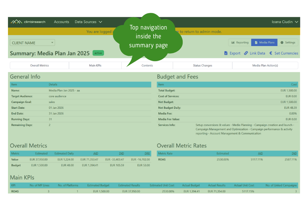

These updates focus on forecast clarity, faster line level review, and a cleaner Planned vs Achieved view for running plans. The right information must be readable at a glance, not just visible.
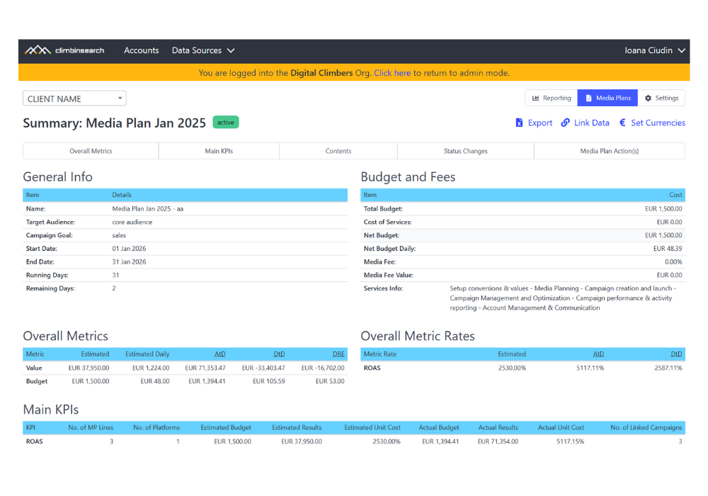
Before this update, the Summary page already included key execution columns like Estimated, Estimated Daily, Achieved to Date, Difference to Date, and Daily Remaining Estimates.
The problem was not that the data was missing. The problem was that we wanted the deviations to be more obvious.
Teams could see the numbers, but they still had to interpret them to answer the question that matters while a plan is running.
🔮 What will we deliver by the end of the flight if the current pacing continues, and how far will that be from the original estimate.
When that answer is unclear, weekly decisions become slower, more subjective, and harder to explain to stakeholders.
Digital media planning tools are not just for building plans. They are for running them, with pacing visibility and feasibility signals while execution is live.
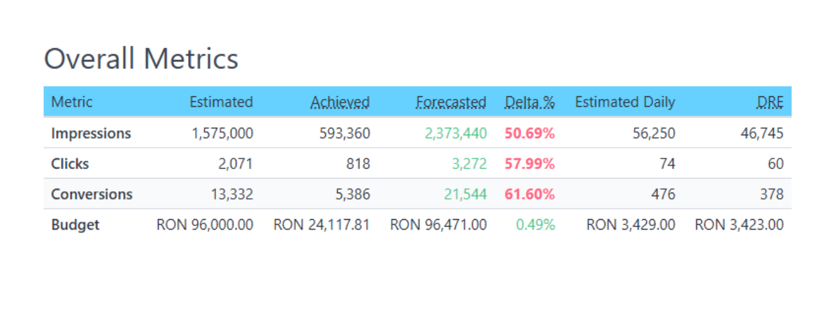
For active media plans with linked campaigns, we added two new columns in the Overall Metrics and Contents tables.

Forecasted shows what the plan is likely to deliver if current pacing continues.
Delta Percent shows how far that forecast is from the original Estimated value.
Together, they turn delivery interpretation into a simple read. Are we trending above plan or below plan, and by how much.
We also introduced color highlights so deviations stand out immediately.
Forecasted indicates the estimated results based on the current pacing. Color coding is not applied for Budget and Rates
🍏Green: Forecasted ≥ Estimated
🍎Red: Forecasted < Estimated
Delta % measures how much actual performance deviates from the estimate. Color indicates deviation severity, not performance quality:
🍏Green: ≤ 20% (normal variance)
🍊Orange: 20% - 40% (attention zone)
🍎Red: > 40% (intervention and explanation required)
This is the difference between data that is visible and execution that is readable
We renamed Achieved to Date (AtD) to Achieved and reordered columns so Achieved sits next to Estimated across tables.
This makes Planned vs Achieved the primary comparison and reduces scanning time in running plan reviews.
We removed Difference to Date (DtD) from all Summary tables.
DtD often pulled attention toward partial period gaps without clarifying what the remaining days require. Forecasted and Delta Percent are more actionable during execution because they connect current pacing to end of plan outcomes.
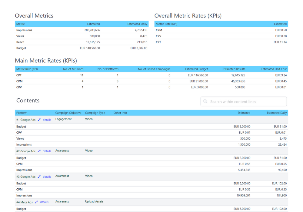
Large media plans often include many lines. When scrolling through Contents, it becomes hard to remember what each column represents.
We added a floating sticky header so column names remain visible while you scroll, making line level analysis faster and reducing interpretation errors.
Forecasted shows what you will likely deliver by the end of the plan if you keep the same daily pace you have right now.
Formula
Forecasted = Achieved / elapsed days * running days
Forecasted color answers one question per metric, per line.
Is Forecasted at least as high as Estimated.
That is why Value can appear red across multiple campaign lines at the same time. Each line is compared to its own estimate, not to other lines.
Delta Percent shows the size of the gap between Forecasted and Estimated. That gap can be small, medium, or large, so Delta Percent can be Green, Orange, or Red depending on deviation severity.

In our screenshot, Value Forecasted is below Estimated on all three lines, so Forecasted is Red each time. What changes is Delta Percent. Line 1 shows a major deviation at 55%, so Delta Percent is Red. Line 2 shows a normal deviation, so Delta Percent is Green. Line 3 shows a medium deviation, so Delta Percent is Orange.
The point of this system is not to label performance as good or bad. It is to make any deviation from the plan visible, then assess it, explain it, and correct it if possible while the plan is still running. Green means normal variance, Orange means it needs attention, Red means intervention is required.
Forecasted can be Green while Delta Percent is Red.
This happens when Forecasted is above Estimated, but the difference is so large that it signals the plan assumptions no longer match delivery reality.
In our screenshot, multiple outcome metrics show this pattern.
Forecasted is above Estimated for these metrics, so Forecasted is Green.
Delta Percent is above 40% for all three metrics, so Delta Percent is Red.
What this means in practice: Green Red does not automatically mean quality is better. It means the plan is deviating strongly from the original estimate, even if it is deviating upward.
All major deviations should be assessed and explained. In many cases you also want to correct the plan execution or the plan assumptions.
Typical actions include reforecasting the month, validating whether early pacing is representative, checking whether volume is being driven by one channel or placement mix shift, and deciding whether to scale, rebalance budgets, or lock the current direction.
Account managers who need clear plan status for client reviews.
Performance and media teams managing active plans with ongoing optimizations.
Clients who need transparent delivery visibility and fast approvals.
Teams that want pacing based forecasting directly inside the plan.
Spotting under delivery early and reforecasting before the month is lost.
Explaining plan feasibility in client calls using Forecasted and Delta Percent.
Reviewing large plans faster without losing column context.
Tracking delivery using a clearer Planned vs Achieved layout.
Forecasted and Delta Percent appear for active media plans with linked campaigns.
Forecast assumes current pacing continues.
Delta Percent shows variance versus the original Estimated value.
Color highlights indicate deviation severity, not performance quality.
These updates lay the groundwork for deviation signaling at line level and overall level.
The goal is to make over delivery and under delivery jump out visually, so teams can intervene fast.
Digital media planning tools should not just store plans. They should help teams correct plans while they are running.
If you want to see this workflow in practice, explore the ClimbinSearch Digital Media Planning Tool, built around Planned vs Achieved, pacing visibility, and line level control.