Every report comes in two cadences:
For the examples below, we’ll use Monthly.
Google Ads Reporting is structured into four tabs:
Together, these tabs form a repeatable reporting workflow.
Daily reporting is for:
Monthly reporting is for:
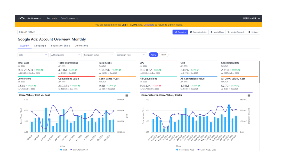
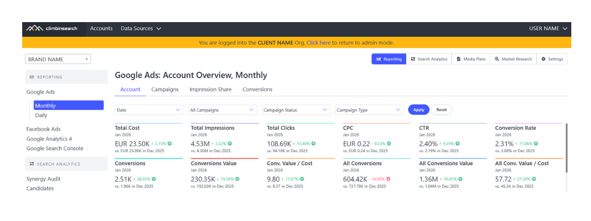
The Account tab is the starting point because it gives you the full performance story in one place: outcomes, efficiency, traffic, and visibility.
At the top, you can control what you’re looking at:
This matters because most reporting disagreements are not about metrics, they’re about comparing different slices of the account without realizing it.
The KPI layer gives you the full baseline, including both scale and outcome signals. Each KPI is shown with a month-over-month comparison, so you can immediately see direction and magnitude: what moved up, what moved down, and where the story likely starts.
The goal of this layer isn’t to “report everything.” It’s to answer fast:
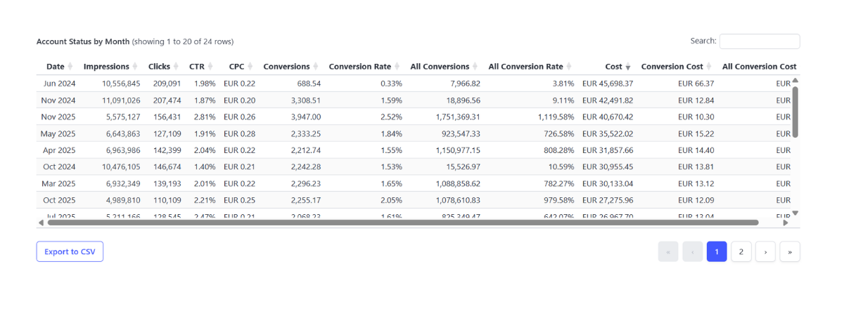
Under the KPI row, the dashboard moves into trend charts that show how the account behaves over time.
These charts are not there to “visualize metrics.” They are there to expose cause-and-effect patterns.

A few examples of what becomes obvious at a glance:

The Account tab makes it natural to read performance from business impact down to scale:
Starting at value keeps the interpretation tied to outcomes. Starting at impressions often produces the wrong story.
At the bottom, you get the underlying table, by default sorted by cost so you can instantly identify the highest-investment months. You can sort by any metric (conversion value, ROAS, conversions, CPC, CTR) to validate the story you saw in the trend charts.
The result: the Account tab becomes a repeatable routine, a place where you can answer, every month:
What changed, why it changed, and whether the change came from outcomes, efficiency, traffic, or visibility.
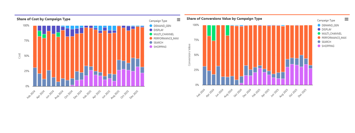
The Campaigns tab is where you stop looking at totals and start looking at structure.
Instead of ranking campaigns in a table, it shows 100% share charts per month, at two levels:
This makes budget allocation and contribution shifts instantly visible.
You can see:
This shows whether spend is concentrated (dependency risk), and what strategic engine dominates the account.
Next, you see:
This reveals where revenue actually comes from.
Comparing cost share with value share exposes misallocation and opportunity:
The screenshot lets you validate the exact drivers behind the shifts.
This tab answers a Search-specific question:
Are we visible where demand exists, and if not, what’s blocking us?
The chart separates:
This turns Search into a diagnostic view:
A second chart, Impressions vs Impression Share, shows how scale and competitive position interact:
This prevents guessing and makes Search opportunity measurable.
The Conversions tab ensures you understand what “conversions” really means in the account.
You see:
If All Conversions rises but Conversions doesn’t, you may be tracking more secondary actions without increasing core outcomes.
Two charts break down evolution over time:
This separates:
It also makes risks visible:
The table lets you connect specific conversion actions to campaigns, validate spikes, and troubleshoot measurement issues.
A practical monthly routine:
Daily reporting follows the same logic, just faster: validate stability and catch anomalies early.
When reporting is structured around drivers, constraints, and outcome integrity, you get:
Google Ads performance isn’t a single KPI. It’s a system and it should be read like one.